Explore Trends and Get Inspired
See How You Can Bring Your Website Into Modern Times
Web design is a constantly evolving field. What looked good and enticed users last year probably won’t be the same in the next. Part of this is due to technology – code languages and developer skills are constantly improving and evolving. But part of it is the same reason fashion trends change – visual taste is subjective and fickle. Feel like your website needs an overhaul? Check out the top 5 web design trends of 2020 to get inspiration for your site’s makeover.
Dark Mode
As more and more web browsers support it, more and more developers are choosing to add a “dark mode” option for their websites. Often, this can be as easy as adding a few lines of CSS, a little script, and maybe a couple of image variations. Each website is unique, of course, and some will take more effort to implement a dark mode. But if you can spare the time, it’s definitely worth it. You can find a quick primer from DeveloperDrive. A dark mode not only shows your commitment to accessibility and providing unique customer experiences, but it makes your font and other elements really pop off the page. Plus, the human eye has an easier time looking at dark images, meaning your users can stay on the website longer!
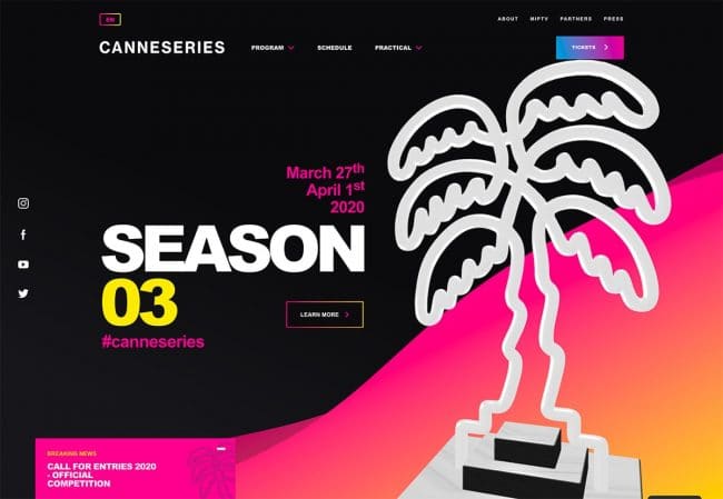
canneseries.com
Hand-Drawn Elements
One of the persistent challenges of web design has been conveying emotion in a realm of technology and clean lines. But with the ever-increasing surge of SVGs and other line capabilities, hand-drawn elements are making a strong entrance to the world of web design. These can be any kind of elements, from icons to background illustrations to entire font families. These quickly inject emotion and human connection into the page, since it’s clear a person had to create the element, instead of a developer simply telling the computer to generate it. If you feel like your site is missing a certain human element, give some hand-drawn elements a try. Even if you can’t commission illustrations for your entire site, a few elements being hand-drawn is a great way to add some character.
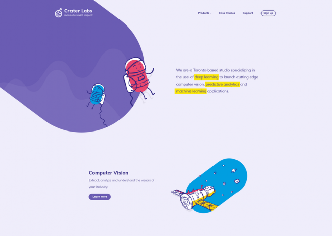
by SixDesign
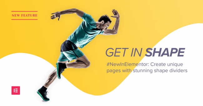
Eye-Catching Animation
As more browsers and devices support animation, the more developers are setting their sights on utilizing. These can range from simple entrance fade-ins to eye-catching, attention-grabbing animations to give a page a sense of life and motion. Animations on hover or click were already prevalent, but what’s gaining ground in 2020 is ‘liquid’ animations, or animations that give off a water-like effect. These are new and interesting enough that they tend to entice users to engage, whether it’s on a button or a video. Check out the hero of this page for an extensive example.
Coming up with the perfect animation for your website isn’t easy, though. It takes time to see all the different variations of even the simplest animation, and picking the perfect one that works is a big undertaking. Don’t choose an animation just for the sake of having animation, but make sure it truly adds something to your website.
Geometric Shapes and “Card Grids”
The natural evolution to the invisible grids that outline a page was to stylize those grids, and use them as design elements. White space and minimal design are still used, but geometric shapes are quickly taking the lead in trends. Some people even go so far as to truly embrace their grids and create a “card” design, like the image below. Soft box shadows and color backgrounds can create this effect as well, leading your user down a more organized and compartmentalized experience.
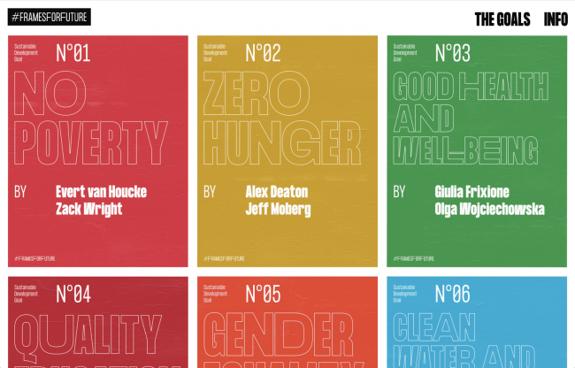
#FramesForFuture
These types of designs also inspired plenty of other geometric elements, featuring a range of simple shapes to create deceivingly complex pages and effects. While these lines aren’t as clean as more minimalistic designs, they still do a lot to grab a user’s attention and add some unique space to any page. Like animations, be sure to choose shapes that truly enhance your site. Maybe work on developing a brand guide to create your site’s personality, and then choose shapes that evoke complementary feelings.
Elementor’s Geometric Shapes
Making Typography Pop
Up until 2020, a lot of designers followed strict rules with their fonts. Text being both on and off an image was rare, and fairly rigid size hierarchies were followed. Rarely were fonts too big, either, because the focus was supposed to go to images. But in 2020, many designers are breaking these rules to great effect. Text in the top panels are massive, with some sites using only text for their hero (no images at all!). Others are mixing and matching text and images, having them overlap and intrude on each other’s space for interesting visual effects. If you think it might look good – try it! 2020 is the year to break typography rules. Big images are still popular, but adding big text to create some contrast and explanation on an equal playing field can make your message more clear than ever.
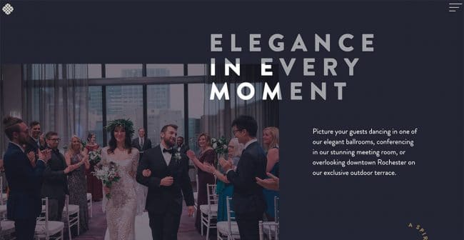
jpowers.events
Hopefully these trends gave you some inspiration for ideas for your own website! But if you’re not sure where to start, don’t hesitate to reach out to Mr. WPress to make your vision become a reality! We’d be delighted to work with you to bring your website into the modern year, or even create a custom theme from scratch that incorporates any of these elements that grab your eye.