Get a sneak peek into how Mr. WPress creates responsive web designs
Whether you’re a web developer or a customer, it’s good to know the workings of responsive design
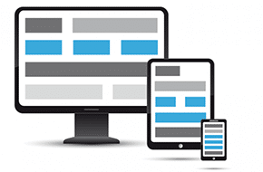
Responsive design is essentially the art of making a website respond to the size of the viewer’s screen. If you were to look at this blog post on your smart phone, it would be a different layout than that of a traditional desktop. And that’s a good thing! If the desktop design were displayed on a phone, it would look like a cluttered mess. If you were to dig into the styles of this blog page, you would see some code that doesn’t kick in until the window size reaches a certain width. That’s responsive design – a design that literally responds to the user’s viewport. It’s standard on every site we design at Mr. WPress. So, whether as a teaching mechanism or a guaranty of our work, we’re going to delve into some responsive design best practices in this blog post.
Pick the method that matches the project
There are two approaches to responsive design – mobile first and non-mobile first. Mobile first is when a website is designed for mobile devices primarily, then styled to lay out better on larger screens later. The opposite, non-mobile first, is what we usually use at Mr. WPress. That’s where the website is primarily designed for larger screens, and then mobile devices and smaller screens are taken into consideration afterwards. We generally find it easier to compress and rearrange the already laid out larger view, but the approach depends on the project to some extent.
For the non-mobile first method, the first step is to style the website regularly, basing it off the assumption that the user will be looking at the website with their browser at full window size on a typical desktop computer or laptop. Then the responsive designs go at the very bottom, so they can override the main styles.
The responsive design best practices
However, we only want the responsive design to kick in when the screen reaches a certain maximum width. The way we accomplish this is with a bit of code, which looks like the code below:
@media only screen
and (max-width: 1200px) {

}
We start with 1200px, because that’s where the styles for bigger screens tend to start break down. Inside of the curly brackets is where we start using styles to rearrange the page content so that it lays out nicely no matter what. Some examples of this are making images display above and below one another instead of side by side, or changing larger font sizes so they fit better. Remember, because of the media query we set up, these styles will only activate when the maximum width of the viewport gets down to 1200 pixels.
That’s only the first query, though, and doesn’t cover small screens like mobile devices. To achieve best practices, we should be using five media queries. The sizes for these are: 1200px, 992px (another typical breaking point), 768px (for tablets and other medium devices), 480px (for smart phones), and 320px (for iPhone Retina and other extra small devices). The mobile first method works the same way, except in reverse order and with minimum width (min-width) instead of max. There may be some circumstances per project where other queries are needed. But in general, we want to try to stay as uncluttered with the queries as possible. The closer to these five, the better!
And there you have it, a sneak peek into the responsive design best practices we follow at Mr. WPress. Every user today is looking for a simple and clean experience, and responsive design is the best way to achieve that no matter what device they’re using. Happy coding!


